We’ve been following BlackBerry’s journey from the top of the smartphone market to the bottom, and it has been extremely tempting on multiple occasions to declare the company effectively dead. Poor decision after poor decision has resulted in the company’s products – which were the absolute must-have status symbols of an entire generation – being seen now as relics from the distant past. There are holdouts, no doubt, but their number is diminishing every day.
BlackBerry, the company formerly known as Research in Motion, has had many chances over the past few years to set its course right, but has instead launched one outlandish product after another; trying anything that might work. We liked the unusually shaped Passport (Review | Pictures), but it was never going to be a mass-market success. More recently, the Classic (Review | Pictures) represented a U-turn in strategy to cater to everyone who hated BB10’s touch interface, and the Leap (Review) tried to appeal to budget-minded fans but missed that mark spectacularly.
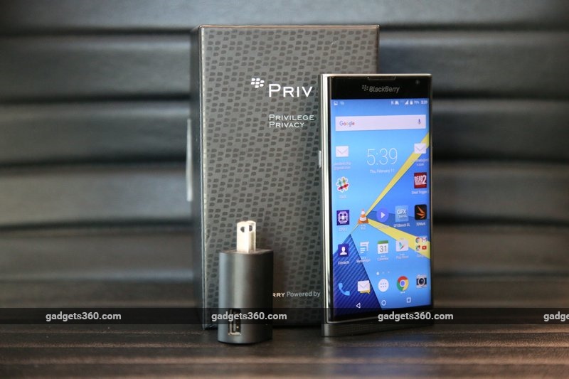
 We now have yet another strategy shift, in the form of the BlackBerry Priv. The company has finally caved to pressure and adopted Android, turning its famous business-first ecosystem into a collection of apps and services. However, priced at Rs. 62,990, this phone has its work cut out for it. Is the Priv finally going to give BlackBerry the success it so badly needs, or is still too little too late?
Look and feel
The Priv immediately feels like a super-premium device, but this is more about its build quality than its looks. At first glance, it doesn’t have the “wow” factor that, for example, the Samsung Galaxy S6 Edge (Review | Pictures) has, but that changes the instant you flick the screen up to reveal the keyboard. It’s been a really long time since we had anything other than a flat candybar phone to play with, and everything about the mechanism from its sound to its smoothness feels really, viscerally satisfying. It’s way too easy to keep absentmindedly flicking the screen up and down when the phone is in your hands, and at no point did we have even the slightest doubt about the durability of BlackBerry’s design.
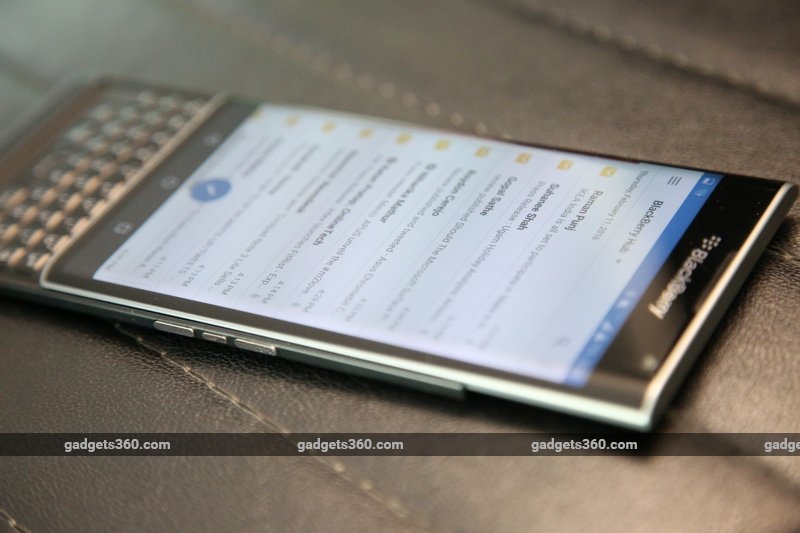
The front is nearly all glass, with curved edges on the sides. The screen itself doesn’t curve like the one on the Galaxy S6 Edge; the space to the sides is mostly the screen border. This means there’s no need to strain to read what’s at the screen’s outer edges, but you’ll still have to deal with reflections that are impossible to avoid.
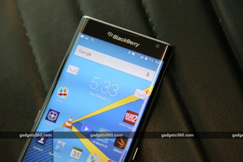
 A large BlackBerry logo is placed front and centre above the screen, with a programmable multi-colour notification LED the front camera further to the right. When the screen is off and the phone is plugged in, you’ll see a coloured bar indicating the current charge percentage along the screen’s right edge. Apart from this, there is no real way in which BlackBerry has integrated the curves into its software or user experience.
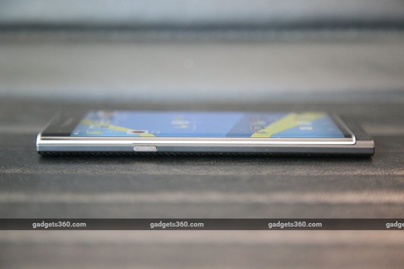
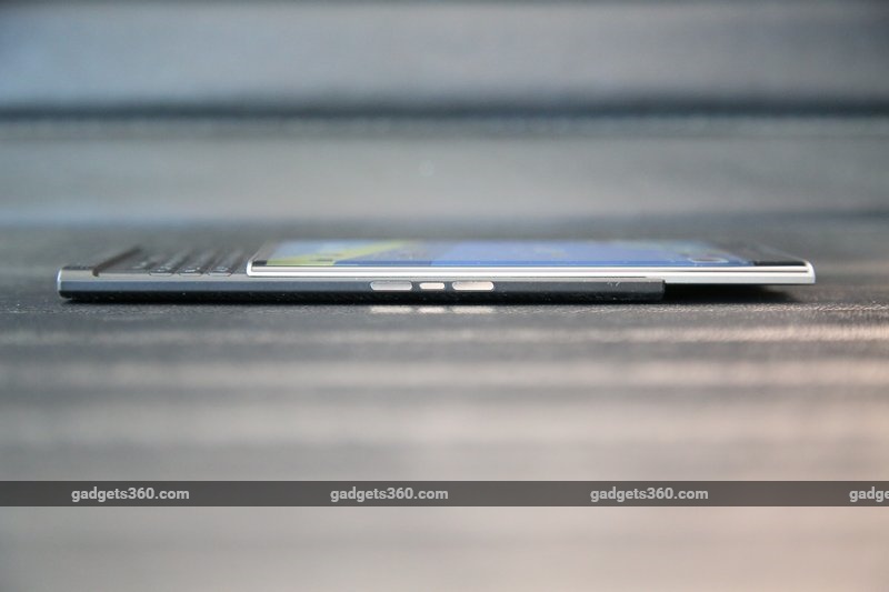
Beneath the sliding screen is a lip that lets you push it up with one hand. Unfortunately, we often hit the on-screen Android home button when trying to do this. The bottom of the phone’s lower half is thick enough to accommodate the phone’s loudspeaker. The power button is on the left and the volume buttons are on the right.
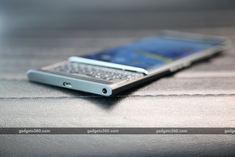
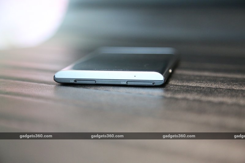
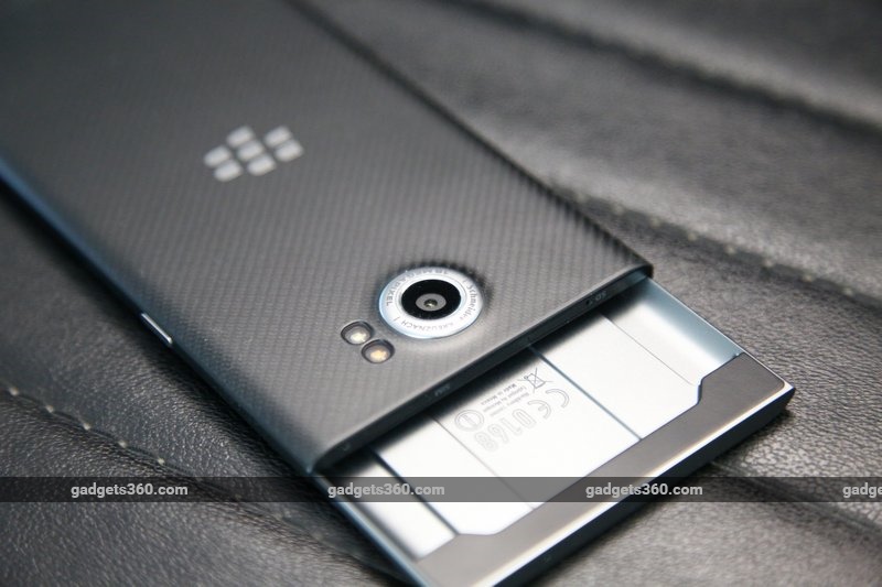
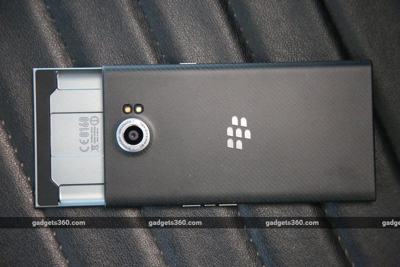
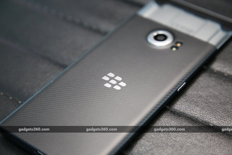 The phone’s rear has a carbon fibre finish which is smooth but still easy to grip. There’s a thick silver ring around the camera lens, which protrudes quite a bit from the rear. The two-tone LED flash is right next to it. The Nano-SIM and microSD trays are located on the top of the phone’s lower half, while the Micro-USB port and 3.5mm socket are on the bottom.
We were concerned about the Priv’s size and weight, especially its balance when open. While not ideal, BlackBerry has done well. What surprised us was that this phone is really uncomfortable to talk on – the protective ridge on top dug into our ears and no amount of adjusting made it any better.
 Specifications
The BlackBerry Priv is a high-end phone with suitably high-end specs, comparable to today’s top performers. Unfortunately, it has launched just weeks before the entire Android world will be refreshed, with every top company expected to launch a new flagship at MWC 2016 in late February. The Priv will look a lot like last year’s news very soon.
That said, the hardware is still quite strong. There’s a Qualcomm Snapdragon 808 processor, with six CPU cores, 3GB of RAM, 32GB of storage with the option of up to 2TB more using a microSDXC card, LTE support on Indian frequencies, NFC, GPS, and dual-band Wi-Fi ac. The display measures 5.43 inches diagonally and has a resolution of 1440×2560 pixels.
 There’s a 3410mAh battery with Quick Charge 2.0, but the bundlded charger does not support quick charging. The Micro-USB port on the bottom supports SlimPort accessories such as video output adapters. The camera on the rear has an 18-megapixel sensor, Schneider-Kreuznach optics, a two-tone LED flash, and optical image stabilisation. Video recording goes up to 4K at 30fps. The front camera is only 2 megapixels, so don’t expect great-looking shots or video calls from it.
Software and usage
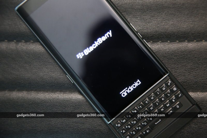
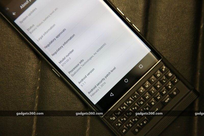
Rather than fork Android, which other companies have attempted to do, BlackBerry has gone with the whole Google package, apps and all. The Priv runs Android 5.1.1 though a Marshmallow update should be released by the end of March. There are lots of tweaks and modifications, but surprisingly not a custom skin that might replicate the BB10 experience more faithfully. To the casual user, BlackBerry’s involvement in the software of the Priv won’t seem any deeper than other manufacturers go, with just a few preloaded apps and cosmetic touches.
 That said, there are security-centric features under the hood. BlackBerry knows what its enterprise and corporate customers demand – as we’ve been told, the name “Priv” comes from “privilege” and “privacy”. BlackBerry promises that it has “hardened” Android to protect your data and defend against malware and intrusion attempts. An app called DTEK gives you an overview of your security settings and what your apps have been up to.
The first thing you’ll notice on the Android homescreen is the trademark red BlackBerry “splat” badge on app icons, letting you know that you have notifications. While eye-catching, you lose the ability to see how many notifications you have in each app. The badge has also been incorporated into the notifications on the lockscreen and in the pull-down shade: a strip of icons along the top lets you see alerts for each individual app or phone function, and for some reason there is a numerical count next to each one here, even though they’re much smaller.
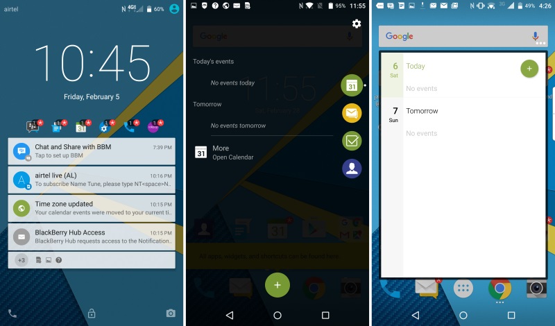 In addition to widgets and app icons, you can have shortcut icons on the homescreens as well. These are very handy, but could confuse some users. These help you perform specific actions, and have descriptive names such as “Check battery level”, “Turn Wi-Fi on/off”, “Schedule BBM meeting”, and “Text contact”. This still doesn’t quite make up for the relatively sparse selection of quick toggles in the notifications shade.
One very neat feature is that you can call up homescreen widgets related to specific apps by swiping up or down on their icons. This lets you quickly pull up your Chrome favourites or VLC’s playback controls, see messages between you and a particular contact, or even check the contents of your Google Drive. It’s really convenient and lets you avoid cluttering up your homescreens. The app drawer scrolls vertically, and there are tabs for widgets and shortcuts beyond what you choose to have outside on the homescreens.
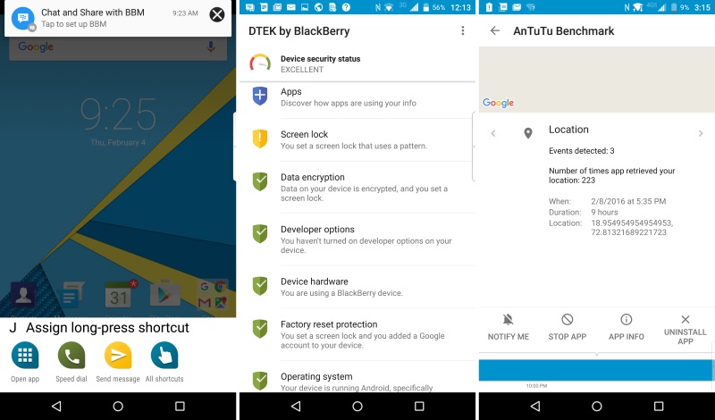 There’s also a semi-transparent tab on the right, and if you swipe inwards from the edge, you’ll be taken to a screen that shows you your upcoming calendar events, unread messages, to-dos, and favourite contacts. You can turn it off if you like, or swap it to the left. It doesn’t serve very much purpose since it duplicates a lot of other functionality.
You navigate through the OS just as you would any other Android phone. That means BB10’s confusing gestures have thankfully been dispensed with, but also that you don’t get to quickly dip into the BlackBerry Hub to check activity. The hub still exists, but as an app, not a seamless part of the underlying OS. It’s a powerful way to sort through emails and messages, especially if you juggle between multiple accounts and services, and it really does make use of the large screen. However, the floating buttons everywhere are really distracting.
 Long-pressing the on-screen Android home button brings up a row of shortcuts to the device-wide search function, Google Now, and the BlackBerry Hub respectively. Unfortunately, it’s way too easy to trigger this accidentally, especially when trying to slide the screen up to reveal the keyboard.
It seems as though BlackBerry put a lot of thought into porting its native experience over to Android, and in some ways it feels as though this is what BB10 should always have been like. Frankly, some of the little touches are so nice that we hope Google steals them and bakes them into Android natively. On the other hand, other manufacturers have done more to take advantage of similar hardware, such as allowing split-screen multitasking or floating windowed apps.
 The keyboard
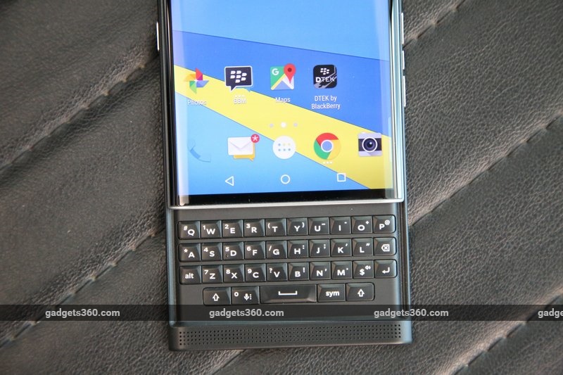
The Priv’s biggest draw is obviously its keyboard, but there is definitely a bit of a disconnect between the device’s hardware and software when it comes to actually using it, because BlackBerry has tried to cater to its legacy users as well as new ones who are already familiar with Android. You can also assign shortcuts to each letter and activate them just by long-pressing that key, like on any classic BlackBerry. Shortcuts within the Hub also work as expected.
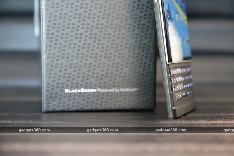
As far as typing comfort goes, the keyboard is excellent. It isn’t as large or spaced out as the legendary Bold series’ keyboards, but it has the right contours and you can get used to it in no time. It flexes a little in the centre, but that won’t slow you down.
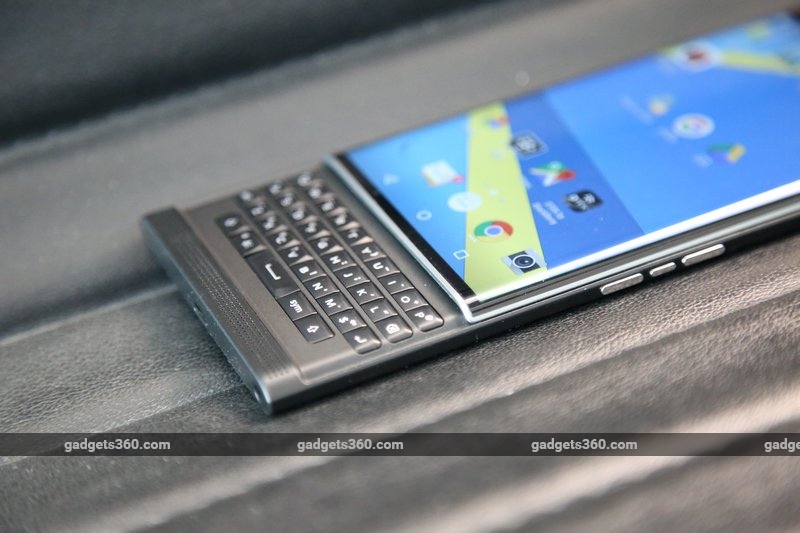 The main problem is the keyboard layout – it has the classic BlackBerry four-line layout with numbers in a block on the left rather than across the top. The Alt key is where you’d expect Shift to be, and Shift is on the bottom row. Enter and Backspace are also in different positions. All this will suit BlackBerry users just fine, but the problem is that this layout is not reflected in the soft keyboard – if you want to just quickly tap something out, you’ll have to use the more standard BB10 layout.
The Priv’s keyboard also gains the trackpad-like abilities which we first saw and loved on the BlackBerry Passport. You can swipe to the left while typing to backspace entire words, and double-tap to move the text cursor around, which are both wonderful features. You can also swipe down to pull up the on-screen Symbols panel, or swipe up to “fling” autocomplete suggestions into your text.
 Speaking of autocomplete, the Priv shows suggestions overlaid on keys when using the soft keyboard (BB10 style) and in a Passport-like bar across the bottom of the screen when using the physical keyboard. This makes other elements on screen jump around when it pops up.
Another thing to consider is that with a standard 16:9 screen, the Priv becomes very, very tall with the keyboard out. BlackBerry has managed to get the balance just right so it isn’t top-heavy, but you will have a tough time reaching for buttons and fields on-screen with your thumbs positioned on the keyboard. You can swipe around to scroll, and sometimes use Enter or Backspace to do things, respectively, but there’s no cursor and no way to select things and navigate around without constantly shifting your hands around. One-handed use is completely out of the question.
 There are definitely people in this world who still refuse to give up their old QWERTY phones, and many more who have had to settle for a touchscreen but would go back given half a chance. The Android world has been sorely lacking physical keyboards for a long time. BlackBerry might have found itself a profitable niche here, but we’d advise anyone interested in this phone primarily for its keyboard to give it a test run at a store before spending a lot of money on it.
Performance and camera
The BlackBerry Priv handles itself very well, and we wouldn’t have expected anything less considering its pedigree. Day-to-day tasks posed no problem, and we found ourselves much more at ease moving around Android than we ever did with BB10 – though of course BlackBerry loyalists will need time to get used to it. The only problem was that the middle-rear of the phone got hot even when we were doing absolutely mundane things like setting up email accounts.
 Benchmark scores were good: we got 60,780 in AnTuTu and 22,271 in Quadrant. 3DMark’s Ice Storm Extreme preset was maxed out, and the Unlimited preset gave us 19,288. Similarly, we saw 24fps in GFXbench which reflected the smooth gameplay we were able to get in 3D titles such as Dead Trigger 2. There’s more than enough horsepower for all your business and road warrior needs.
However, BlackBerry is also touting the Priv’s entertainment capabilities, and in light of that we have to say the screen was great in terms of sharpness, brightness, and colour reproduction. However, reflections on the curved sides made it difficult to enjoy gaming and movies except in darkened rooms. The speaker on the bottom is excellent, pushing loud, rich sound that didn’t distort even at high volumes.


 (Tap to see full size images)The camera app is a bit cluttered, and requires multiple taps to do basic things like switching to video recording. We liked the fact that the slide-out keyboard gave us a good grip when taking photos, and the spacebar acts as a shutter too. You get live filters, a panorama mode, a timer, and an option to crop to 1:1 square photos. Picture quality was good, but not especially impressive considering this phone’s status as a flagship. Daytime shots felt a little washed out, and fine details didn’t quite make it when examining photos at full size.The front camera is quite awful, but 4K videos taken with the rear camera looked good.
Battery life was excellent. We ran through at least a day and a half with multiple email and messaging accounts active, a bit of gaming and video playback, and plenty of 4G data usage. Our video loop test lasted for 9 hours, 32 minutes before the Priv needed to shut down.
 Verdict
Will long-time BlackBerry users be happy transitioning to Android, or will they lose what they cherish most? That’s the unfortunate question that anyone still clinging to their Bold or Curve will have to answer for themselves. The Priv isn’t quite the single-minded business tool that its predecessors have been, and while we understand the tradeoff in favour of versatility, the Priv doesn’t do very much that other high-end Android phones don’t already do. The massive advantage of native Android apps makes the Priv more attractive than BB10 devices, but not more so than, for example, the Samsung Galaxy S6 which now costs about half as much. In fact, without today’s conveniences such as a fingerprint reader and a decent front camera, the Priv actually comes across as a little old-school.
 For you to choose to spend Rs. 62,990 on this phone, you’d have to be majorly invested in BlackBerry’s keyboard and promise of security, or just really be a fan of the brand. That also means that there’s very little to tempt those who are perfectly happy with their iPhone or Android phones. The target audience of die-hard BlackBerry fans who are willing and able to afford this much seems like a minority within a minority, and it might not be enough to pull this company back from the brink.
If BlackBerry had trimmed some features and delivered an Android phone with a keyboard at a lower price point, we’d have been far more enthusiastic, and the company might have found itself some new fans. However, everything launched since the Z10 seems pointlessly overpriced, chasing an audience that might not even exist. All predictions of BlackBerry’s demise have thus far not come to pass, but we’re not sure how long that can continue at this rate.
[“source-gadgets.ndtv”]


